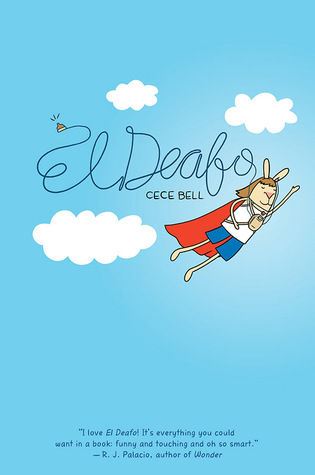
Bell contracted meningitis when she was four years old, and lost most of her hearing as a result. With the help of some powerful hearing aids, she was able to participate in the hearing world. El Deafo chronicles the first ten years of her life, as she wrestles with her feelings of isolation and shame at being the odd girl out. But describing the novel that way really misrepresents its tone, which is poignant, yes, but also laugh-out-loud funny in many places. It's also deeply perceptive about the social nuances of elementary school, and the frustrations, sorrows, and triumphs of making friends at that age.
But what about Newbery? Nina Lindsay writes thoughtfully about the way the criteria apply to El Deafo, noting, "I do not believe that these criteria tell us that the text must carry the entirety of the plot, characters, setting and style. Only that we must find those elements distinguished within the text…at least whichever elements are pertinent to the text."
 That's fair, and I think, in a book like Penny and Her Marble, it can work. I don't think it works here, though, for one crucial reason: in many panels, the text is inseparable from the illustrations. That is, the text itself has visual qualities, and when you render it as plain text, you take away a large chunk of the meaning. Consider the page on the right, where Cece sneakily turns off her hearing aids to drown out her new friend's bedtime chatter. Bell represents the muffling of the friend's voice by depicting it in fainter ink - a technique which she uses (with great effectiveness) throughout the book. In a panel like that, the text is a visual object, and I don't think we can consider it as text anymore. This kind of visual storytelling is part of what makes a book like El Deafo so distinguished, but it also makes it impossible, for me anyway, to consider the text separately from the illustrations.
 I think we're still learning how to discuss and evaluate emerging media for children. Will our awards criteria keep up? The ALSC awards are notoriously slow to change, and I think that's a good thing, for the most part. I do hope there is a place for El Deafo in this year's awards pantheon, though.
Published in September by Harry Abrams

One of my favorites of the year.
ReplyDeletethe book is the best what i like about is that after everything she still loved everyone and she didnt care if people look at her or what they think about her
ReplyDelete